
Medical center website redesign
Client: UVM Medical Center • 2015-2017 • My role: UX research & design, information architecture, meeting & process facilitation
Challenge
The Medical Center’s marketing and web team knew it was time for a website refresh; their current website had usability, organization and functionality issues, causing problems for customers and staff. The challenge and goal for this project was to redesign the website from the ground up.
Team
Our team included me, UX/UI designer Corey Machanic, and a handful of great folks from the Medical Center’s Marketing & Communications team: Alex Elkaliouby, Andy Campbell, Matt Brinkerhoff, Katrina VanTyne, and web team manager Mike Maloney.
Process
Throughout this project, I drove our design process and ensured it was as user-centered as possible. This was a quite long and complex project; here’s a very high-level overview of what our process looked like.

Let’s dig in.
Baseline measurement & insights: analytics & site survey review, usability testing
Before we got into the redesign, Mike Maloney wanted to get a handle on trends and problems with the current website. I did an early sub-project that involved the following:
Search analytics review: Taking the top 50 search terms over a 5 month period, I used both site search and navigation to attempt to find each term.
Interviews & baseline usability testing: I did quick ‘guerrilla’ interviews with patients & families in the medical center, along with semi-structured interviews and usability testing with ‘health optimizers;’ 18 people in all. The goal was to understand more about why people use the hospital’s website, how they get information about their care and the medical center, and to discover additional usability issues.
Analyzing open-ended results from a recent survey about the website
Analyzing website analytics (focusing on mobile)
Synthesizing prior recommendations made to the hospital by other consultants
I assembled a report with key insights and recommendations, organized according to difficulty level using a ski sign metaphor (Easiest, More Difficult, Difficult). This is Vermont, after all.

Competitive analysis & inspiration gathering
I put together an internal deck that pulled together our team’s favorite examples of interesting hospital websites from around the country and world. We liked Stanford’s autocomplete, for example:

Feature & content requirements
I kept a running list of requirements, thoughts, and ideas as our project progressed. It’s just a big old document and not much to look at; but it helped prevent the team from forgetting loose ends, and it set the stage for content mapping and user story creation.
Information architecture: open and closed card sorting
Early on in this process, our team needed to totally rethink the website’s information architecture. Having audited our content and gathered inspiration from other successful websites, we went through a few exercises:
Open card sort
Using a representative sampling of website topics, team members organized them into ‘like’ categories and named the categories.
Closed card sort
We then stress tested our categories with the following exercise: I printed and cut out every page title from our website, as well as category headings, and our team physically grouped the pages to see whether they all had a home. We were surprised by how well most of the content fit.

Many healthy debates took place
Finally, we took that same closed card sorting exercise to our Patient and Family Advisory Council and got valuable additional feedback.
Content mapping
Our team also had to spend a lot of time thinking about different content types; I mapped out a diagram of our content types (e.g. our ‘nouns’) and how they related to one another. This helped us start to plan and account for interface requirements.

Personas
Using data collected throughout the project, I put together a set of 6 illustrated personas to represent some of our key users’ needs, goals, and state of mind. I read the book Design for Real Life during this project and was struck by the importance of taking into account the ‘stress case’ (or worst case scenario) that users may encounter. This is especially important in healthcare. For our stress case, we created Tenzin, a new american with limited language skills who is in an emergency health situation.

How could we keep from forgetting about our personas once we’d put so much effort into creating them? I tacked them up on a board and brought the board into each team meeting so the personas were, in effect, attendees.
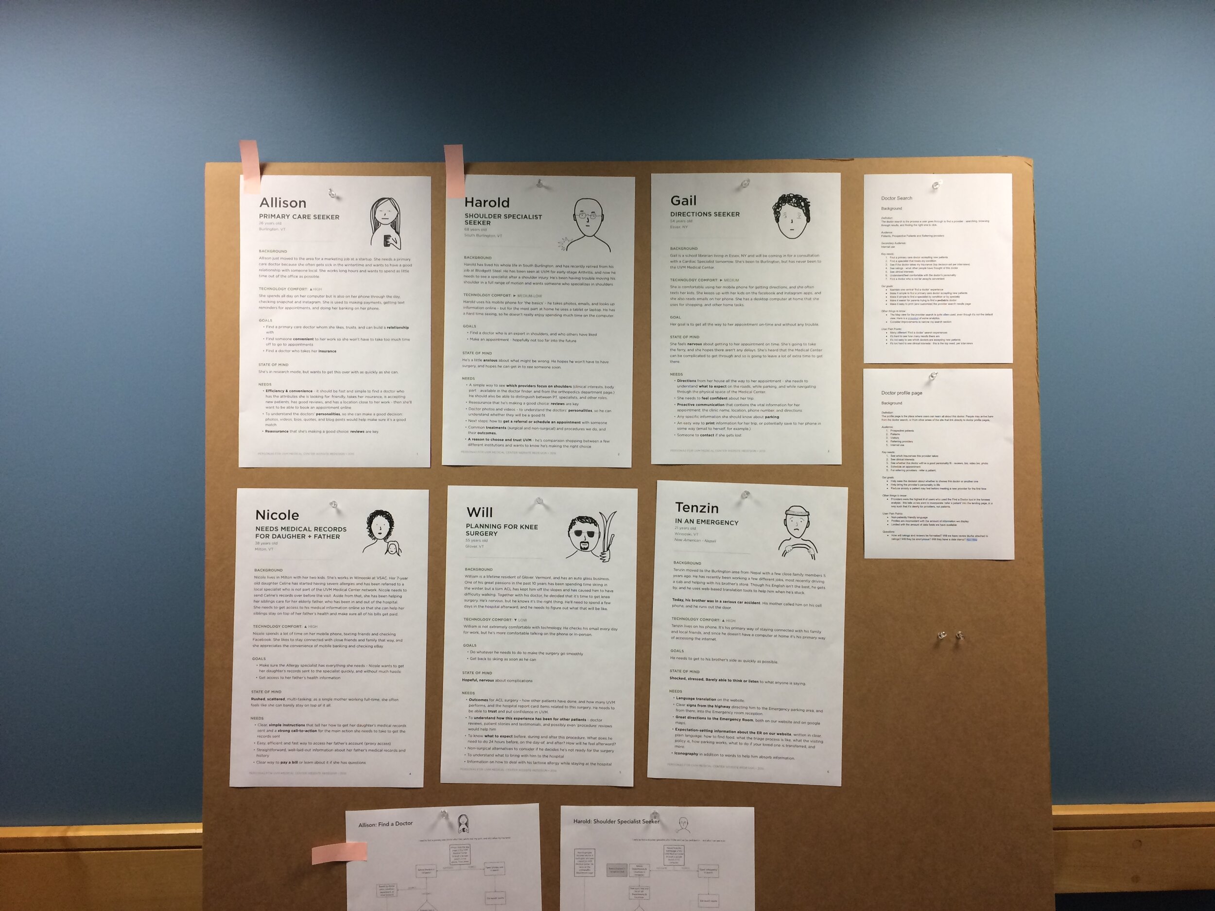
I also created little stickers for the team to put on their computers or around our space.

Our personas were very central to this project and were an important part of staying focused on our users’ needs.
Design principles
I put together a set of 10 design principles that our team referred to constantly throughout the project. “Put patients first” was one of our most important principles, because our website tended to use organization-centric language and navigation. Importantly, we got ‘sign off’ from top hospital leadership on these principles at the very beginning of our process.

User journey flow maps
Using our personas, I put together flow maps to illustrate how users could accomplish common tasks. Here’s an excerpt:

Sprint planning, user story writing
Our team organized our work into design sprints, which included design collaboration between me and Corey, review with the full team, usability testing if at all possible, department review as needed, design revisions, and planning the following sprint. I took the lead on sprint planning, and I wrote user stories for each feature and sprint.
You know, this was quite a lot of work, but there isn’t a great visual for it. Lots of thinking, writing, and collaboration.
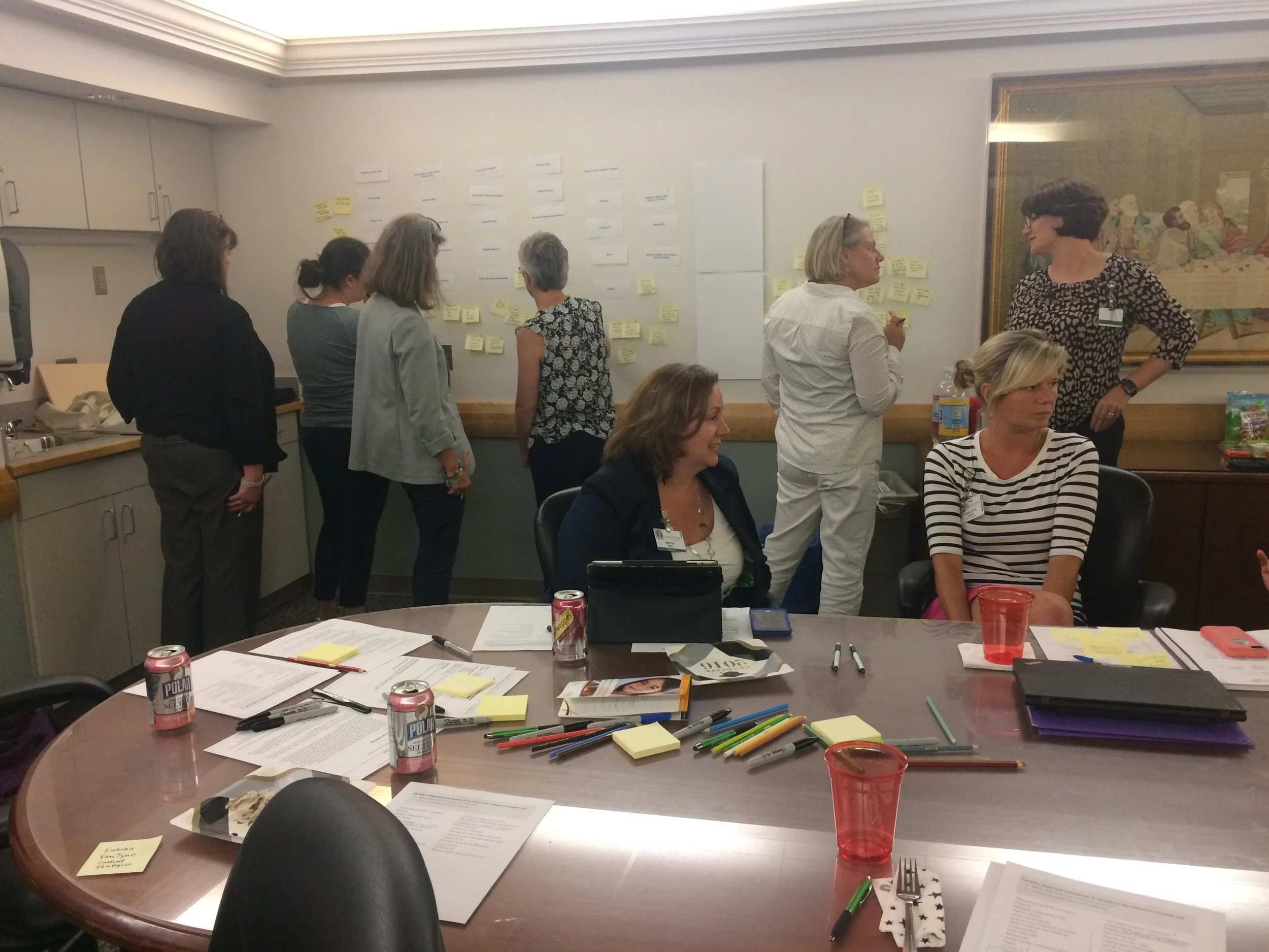
Team meeting facilitation
I care about making meetings useful. I spent time each week planning activities to ensure our team got what we needed to out of each meeting, while also making sure each team member had a voice - and that we all had fun. Chocolate was frequently distributed along with sticky notes.
Stakeholder workshops & presentations
Right from the beginning of this project, we held workshops to get input from key stakeholders across the hospital. We presented to hospital leadership multiple times, conducted content workshops with the Cancer Center, Children’s Hospital, Adult and Pediatric Patient & Family Centered Care groups, and Pathology Department; we also held feedback sessions with many other departments.
A content workshop with the Pediatric Patient and Family Centered Care group
This outreach was vital to the project and helped us bring stakeholders along through the process.
Sketching, prototyping, design system planning
Corey and I collaborated closely on interface design. We spent a lot of time drawing together, and we co-developed all of our responsive design system ‘components.’ I basically created wireframes or low-fidelity mini-prototypes for each component, key page, and complex flow (like site search and ‘find a doctor’ search), while Corey created more refined visual comps and an interactive and responsive HTML prototype.
If you have a chance, you should work with Corey! It was a joy to work with a smart person with complimentary skills. He wrote me, years after the project in 2023:
“I was spoiled by our experience together at UVM Med. I now feel like every project needs a ‘you’ and and ‘me’ on it.”
Usability testing
Using Corey’s visuals, I also put together a quite comprehensive, clickable Adobe XD prototype that we used for usability testing (approaching patients and visitors in the hospital lobbies) and department presentations. I tested with users every few weeks through the latter half of our project, and we got important feedback that helped us make revisions along the way.

Here are some sample page snippets, at desktop size and prepped by Corey:

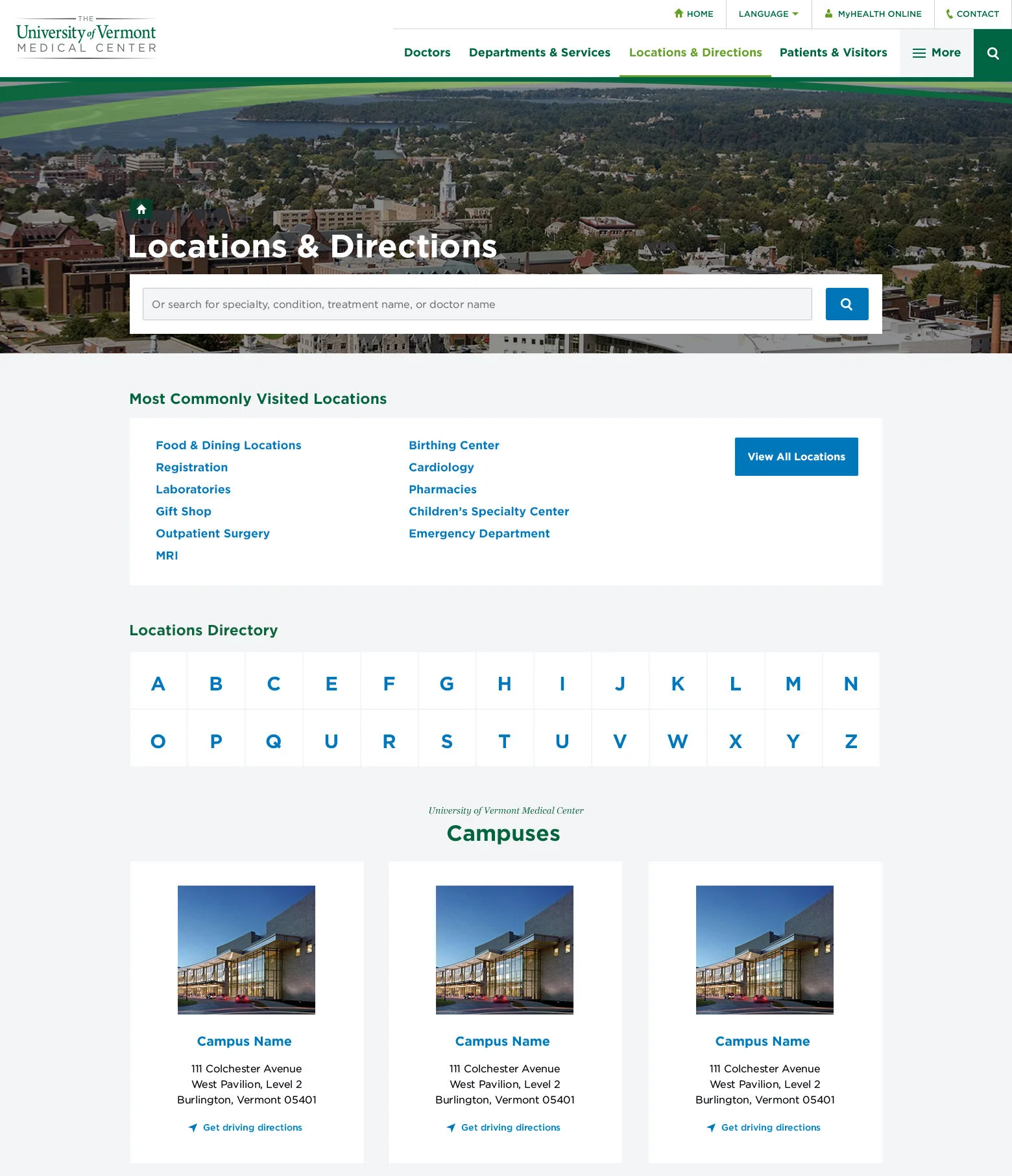

Outcome
I hold this project as an example of an ideal user-centered design process, and the whole team was very proud of the work. While this design has not yet had the opportunity to get built, aspects of it have been folded into the existing website.