Medical bill redesign
Client: UVM Medical Center • 2017 • My role: human-centered designer, copywriter
Challenge
At the UVM Medical Center, where I consulted for a number of years, we realized our medical bills were problematic. They were confusing to read; it wasn’t clear how much was due, when it was due, whether or not you were behind on your payments, or what to do if you needed help. So we got high-level support and set out on a journey to redesign our bills using a human-centered design process.
Team
Our team consisted of Jeremy Beaudry, a fellow experience designer; Julie Sloma, a writer and communications strategist; Colleen Clark, design consultant, and me. Each team member participated in all activities, and I paid special attention to developing our strategy and optimizing copy.
Our objective: to create a more legible, understandable, ‘less terrifying’ medical bill.
Process
Research
Interviews and guerrilla usability tests
To kick off our project, our team of designers and writers did some guerrilla usability testing of the existing bill with patients and staff. Usability issues were widespread. For example, no one realized the bill was past due, and the total amount due and due date didn’t draw people’s attention. We learned about a many problematic terms, like ‘Contractual Allowance,’ that cause confusion.
We also spoke with the phone and in-person customer service representatives who help patients with billing questions; they had many insights for us.
Inspiration
We then gathered inspirational examples of bills we liked from both inside and outside of healthcare and posted them up on the walls of our studio. We also took a detailed look at the submissions to the ‘A bill you can understand’ design challenge that Mad*Pow put on last year.

Insights & Strategy
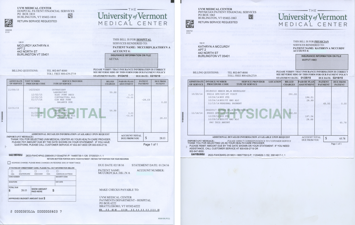
One of the biggest problems customer service folks described is that patients often receive two bills for the same visit or service: one from the “Hospital” (for anything related to using the facilities, like lab work or costs related to staying at the hospital) and one from the “Physician” (charges from the specific physician(s) who treated the patient.) This 2-bill system is common in hospital systems, but it causes endless confusion for patients. They don’t understand why they’re getting another bill, when they just paid one. This confusion can cause patients to ignore bills and sometimes even be sent to collections.
Here are the two bills side-by-side — you can see why people get confused, especially if these bills arrive in the mail at different points in time:
Other insights:
People assumed first page of the bill was a summary of charges, when it was actually the start of the detailed charges. Their eyes went straight to the detailed charge listing.
Total amount due and due date were hard to see
Phone number did not stand out
No one noticed that the account was past due — it didn’t pop out
Financial Assistance/reduced payment info was hard to find
Font & contrast issues; our font was too small for low vision folks
Language inconsistency & jargon; “Contractual All” was especially confusing
Design Strategy
Start with a summary of key numbers; follow with the details
Use color and contrast to call out the most important elements
Make the bill less terrifying
Patient Experience Principles
These described what the experience should be like from a patient perspective. As a patient:
“It’s easy to see how much I owe and what the bill is for.”
“It’s clear how I can get help with my payments or ask a question.”
“My account status is clear.”
“My payment options are clear.”
“The bill is in language I understand.”
“I can read it even without my glasses.”
“It’s clear what type of bill this is.”
“The layout is clean and calming.”
“I’m not stressed about this bill.”
This work set us up well for the next phase.
Prototyping and testing
Armed with our insights and principles, we went back to our studio and started sketching up quick prototypes. We kicked off by running a two-day ‘design sprint,’ a focused period of time in which we create a prototype, test it with real people, and learn from it. We spent a day brainstorming and sketching out concepts based on our prior research and insights.


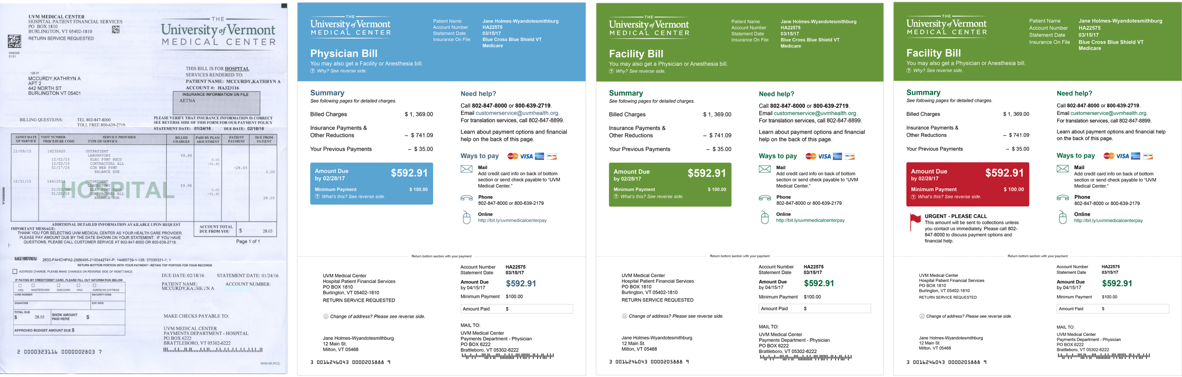
After consolidating our favorite ideas, we created a prototype and tested it in the field, with great initial results. Since that time, we have cycled through many more versions of design and testing, with Jeremy leading the visual design and layout. Below shows the current bill on the left, and some sample redesigned front pages on the right.
Key features of the new design include:
Strong use of color to identify ‘type’ of bill (blue is for Physician, green is for Facility)
Amount and date due are strongly highlighted with color
For accounts that are past due, this highlight turns to orange; for those nearing collections, it turns red and a warning message appears
Phone number and how to get help are better highlighted
‘Ways to pay’ is clearer
Font size and contrast were increased throughout
Patient feedback led us to an innovative new ‘minimum payment’ option. Similar to a credit card bill, for people with higher balances, there is an option to make a reduced ‘minimum’ payment and pay the bill off over a longer amount of time.
Result: people like it
We’ve had very positive feedback from the people with whom we’ve tested the new bill design. The following quotes are from three different people:
SO much better! Not as daunting, more friendly.
It’s easier to read and understand.
I like the summary. It’s easy to see how much is due and when.
Next steps
We’re currently in the process of working with our billing statement vendor to bring this new bill design to life. This is one of the most challenging parts of the process, because it depends on coordinating many diverse groups of people — in addition to our bill vendor who creates and mails our bills, we also need to work with the bank that processes the billing slips and our internal folks who work with our billing data systems. Fortunately, we have an excellent, enthusiastic project team that encompasses billing leadership, data science, design and communications.
We are keeping our eye on the ultimate goals of reducing confusion, making our bill less terrifying, increasing our rate of payment and reducing the number of folks we send to collections. We can’t wait to share the final design once it’s launched.
Postscript: the design launched, and I was somewhat delighted to receive many of these bills myself. However, due to merging technical systems and a push toward online payments, the newly-designed bill eventually became less used. C’est la vie!