Hospital wayfinding – research & strategy
Client: UVM Medical Center • 2016-2018 • My role: Human-Centered Designer, with special focus on research & synthesis
Challenge
The UVM Medical Center knew it had a wayfinding problem. Visitors constantly wandered around looking lost, people showed up for appointments at the wrong location, and staff spent a lot of time giving directions and escorting people to their destination. The hospital had begun looking at technologies and apps to try to address these problems, when my smart colleague Jeremy Beaudry stepped in and recommended a larger research project to discover and define our underlying wayfinding problems. Along with Jeremy and me, our core team during this phase included other members of the Marketing & Communications team, Karly Moore, Alex Elkaliouby, and Mike Maloney.
Our objective: to build a comprehensive understanding of our institution’s wayfinding problem and create a foundation for future redesign work
Process
Detailed walk-throughs and drive-bys
Over the course of a few weeks, our team walked every hallway in our main campus. We tried to put ourselves in the mindset of people who knew nothing about the space (and this was easy, in many cases, as we were traveling a lot of new territory.) As we walked, we looked around to see what cues the space gave us.

Alex and me on the hunt for information.
Problems with signage were ubiquitous. The color and contrast of many signs was not sufficient, and their placement often didn’t support easy navigation. Sometimes there weren’t enough signs:

Sometimes there were too many:

It was valuable for our team to experience this process up-close. In addition to carefully walking and documenting our main campus, we did a driving tour to understand what it was like to approach the campus from various directions.

Approach to the parking garage – which visitors describe as ‘scary.’
Interviews with frontline staff
We spoke with key people and departments who spend a lot of time giving patients directions: Security, Registration, Volunteers, Info desks, lobby attendants, and front desk staff at offices all over the hospital. We asked them about the common questions they received, and their strategies for getting people from place to place; we also collected any materials (letters, maps, etc.) they gave patients to help them find their way.
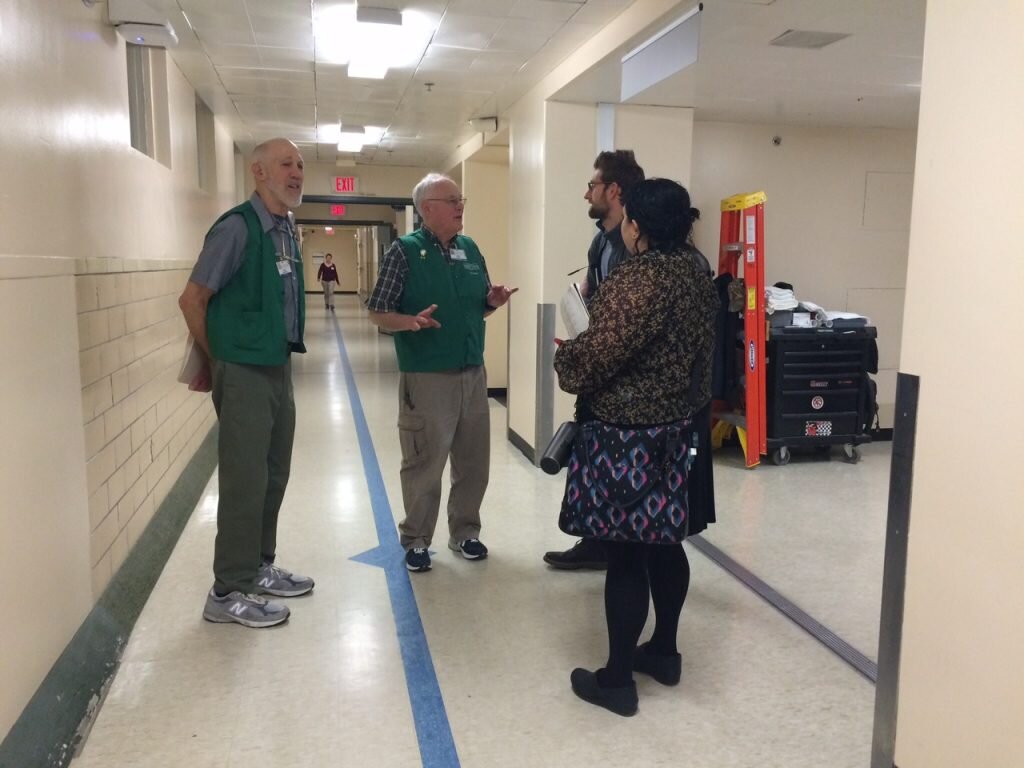
Jeremy and Alex speaking with volunteers on our travels
Co-creative workshops
It was important for our team to bring patients and staff into our process. We held multiple workshops intended to gather further input and get others involved in imagining and creating solutions to some of the key problems we were learning about.

A patient shows her team’s idea for improving the parking garage entrance.
Design Sprints
To energize our team and test some assumptions, we did multiple ‘design sprints’ – a focused time of brainstorming, prototyping and learning about one specific problem. For the first sprint we chose the problem of naming.
Our medical center has many different buildings, or wings; some are new, some are old. All together, these buildings together comprise two main zones of the hospital — but there are no consistent, official names for these two large zones. In practice, staff use many different terms to refer to them, depending on how they perceive the space or how long they’ve worked at the hospital.

Different words are used to describe the same areas.
Our prompt for the sprint:
How might we create a naming convention that helps patients understand where they are and where they need to go?
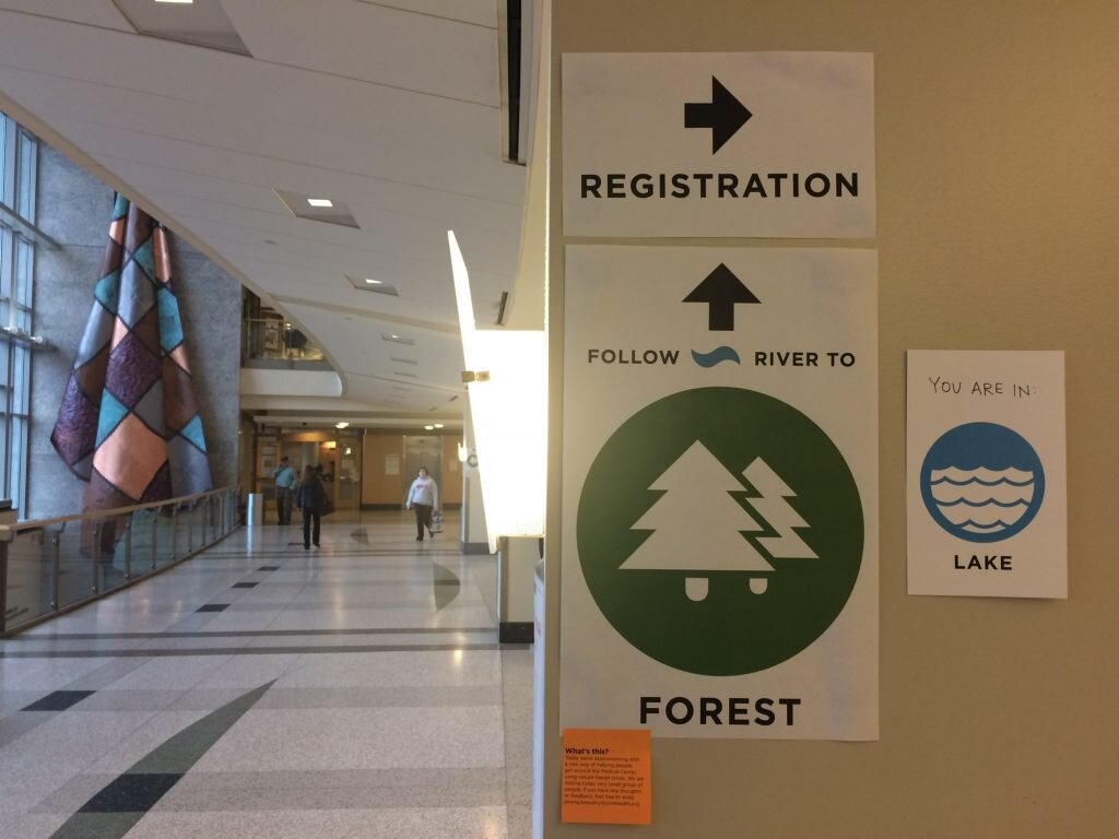
After the first day of brainstorming, we developed a concept consisting of a new zone system based on natural ecosystems: Forest, River and Lake. We decided to test this idea in the hospital for a 2-hour duration on the following day. We modified a hospital map to overlay these ecosystem zones, and Jeremy created temporary (yet quite polished-looking) signs to post up within the hospital that would lead visitors between these zones.

Temporary map used during our design sprint intervention
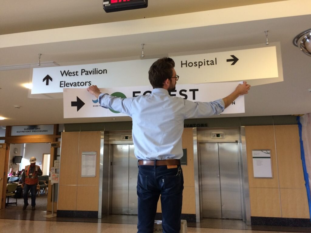
Jeremy putting up a sign the morning of our sprint.

Gathering feedback from visitors
After we’d posted the temporary signs, we intercepted visitors who were not in a hurry and asked them to give us feedback as they used it to find their destination.
People loved the concept:
“I love this.” –Patient
“I find it calming.” –Staff member
“The simplicity is good.” –Staff member
“I could have used this yesterday. I needed a GPS.” –Visitor
“It makes me feel like: I can do this.” –Patient
“Anyone can use it. Even if you can’t read you can get there.” –Visitor
We learned a lot from this little design intervention; not only that the concept had some promise, but that by making our work visible in this way we could raise excitement from patients and staff. If you’re interested in reading more, I wrote up a longer description of our design sprint called Sprinting to the forest – check it out here.
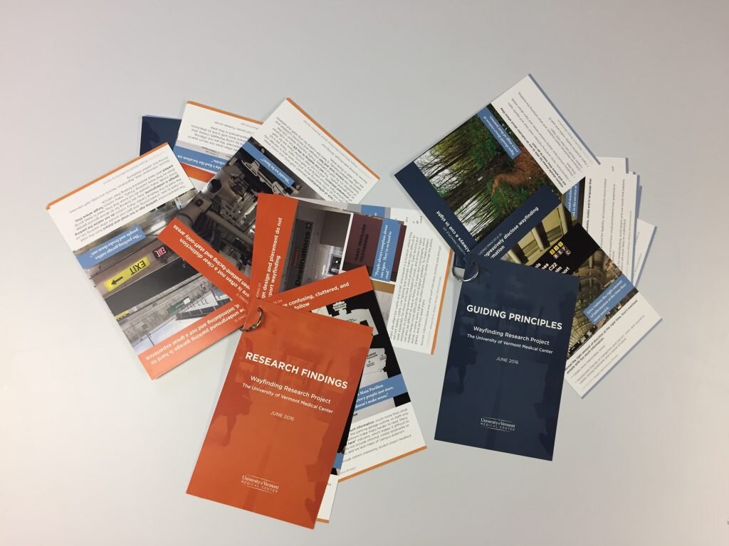
Findings and Design Principles
Our whole team gathered together with all of our field notes and went through a multi-day process of distilling key insights.

We pulled out 20 important findings, and 12 guiding design principles to help guide eventual design work. Some examples of key findings:
Visitors do not understand how all of the floors in the hospital buildings connect
There is often not a clear distinction between patient and staff-only areas
Pre-appointment directions and instructions are inconsistent
Examples of design principles included:
Progressively disclose wayfinding information
Always a cue in sight
Reduce stress and cognitive load
Jeremy put our findings and principles together into these beautiful ring-bound cards, which we printed and brought to our final presentations.
Short-term ‘quick wins’
Prototyping and testing new interior and maps
One quick win for our team was redesigning our interior floor maps. We went through a process of vetting the information on them, working with patient facing departments to optimize them, and giving them a visual refresh.

A workshop with the registration staff to get feedback on internal map drafts
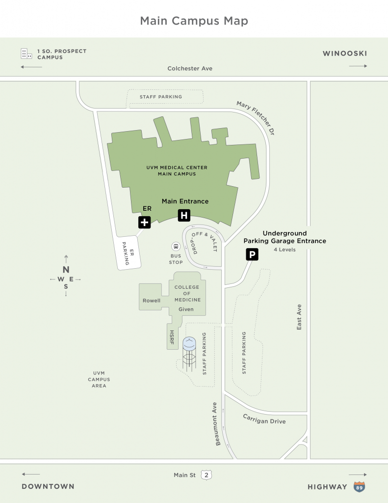
In addition to interior maps, we worked with designer Alli Berry to develop maps of our four campuses. We showed drafts of these maps to visitors and asked them to show us how they arrived at the hospital; where they parked; and were they currently were sitting. We found these new maps much more effective than the prior version. Below is a sample for our redesigned Main Campus map:
Improving contrast by painting a key wall
Our team noticed that a very important wall that directed people toward parking had poor contrast: black letters on a dark red background. We worked with our facilities team to identify a light blue color that would allow the letters to better stand out, and the wall was painted:

Outcome
Much to our excitement, after giving our final presentation to various levels of leadership, this project continued to progress. Along with our team members in the Facilities department, we went through a process of selecting an expert wayfinding design firm to help us develop a new detailed system, which was implemented after I left the organization, between 2018-2020. Anecdotal evidence from staff tells me that the new system has been highly successful. That is what we love to see!
Read more
Sprinting to the Forest – an article describing our wayfinding design sprint.
This project was also part of a presentation Jeremy and I gave at the Interaction17 conference: